About
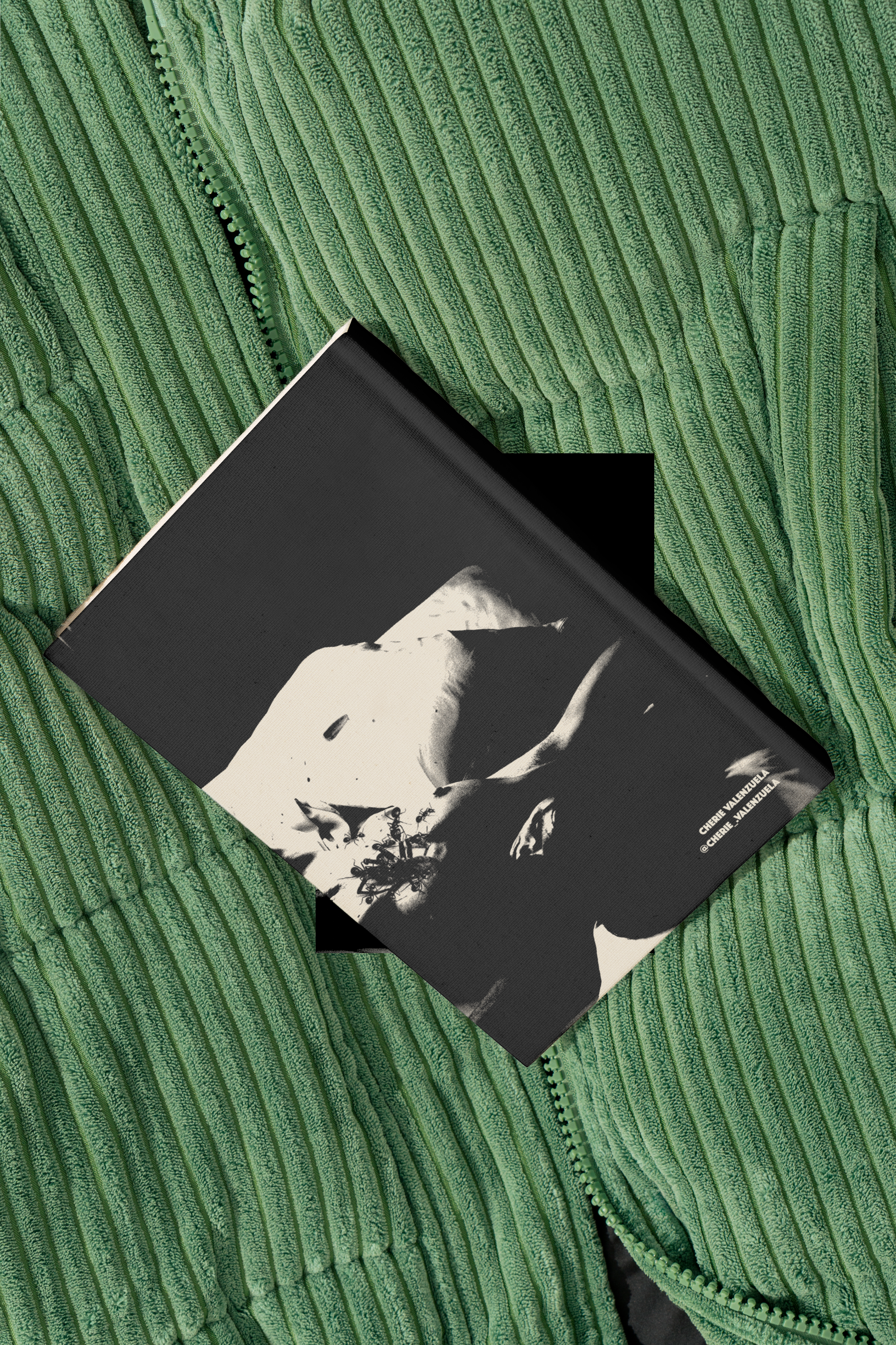
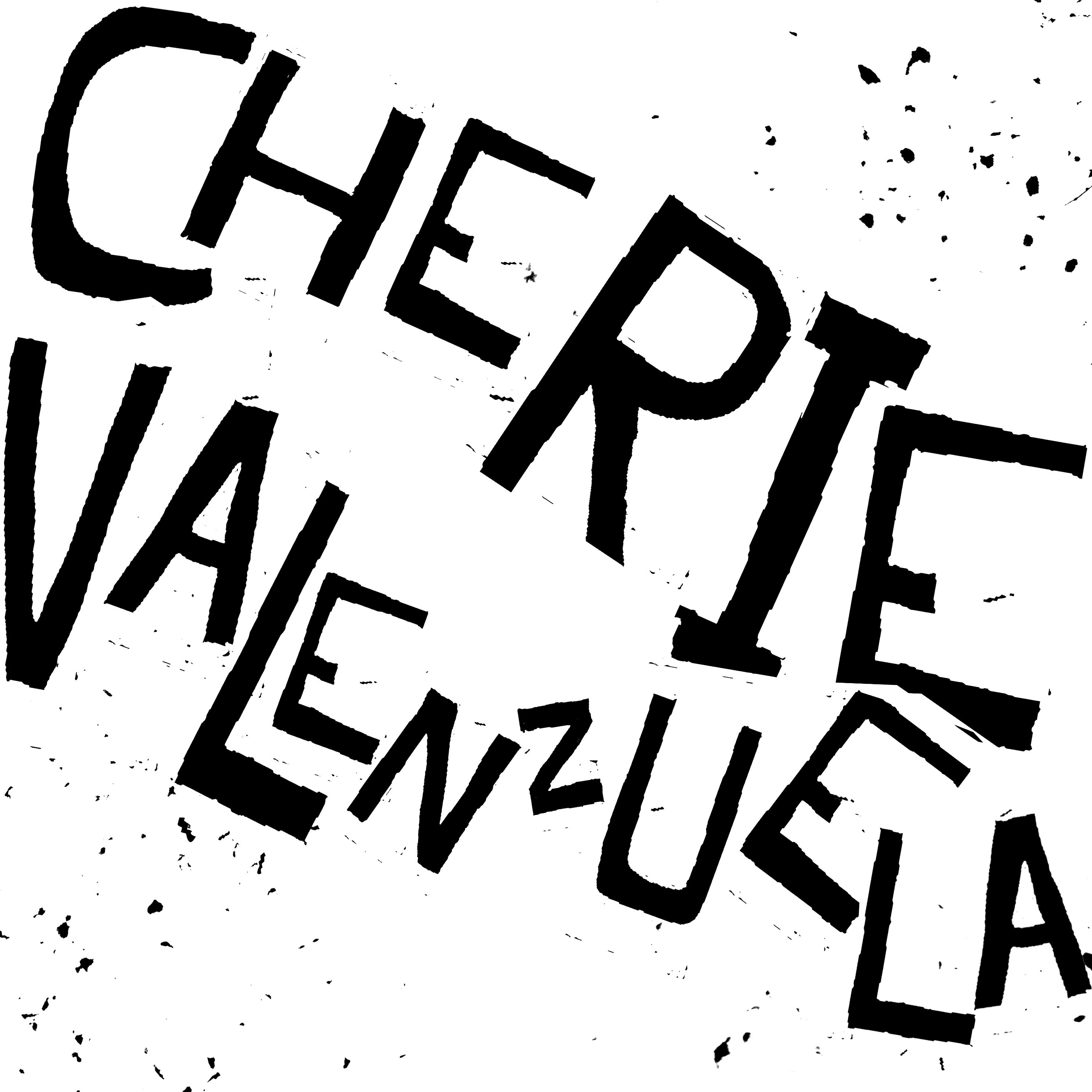
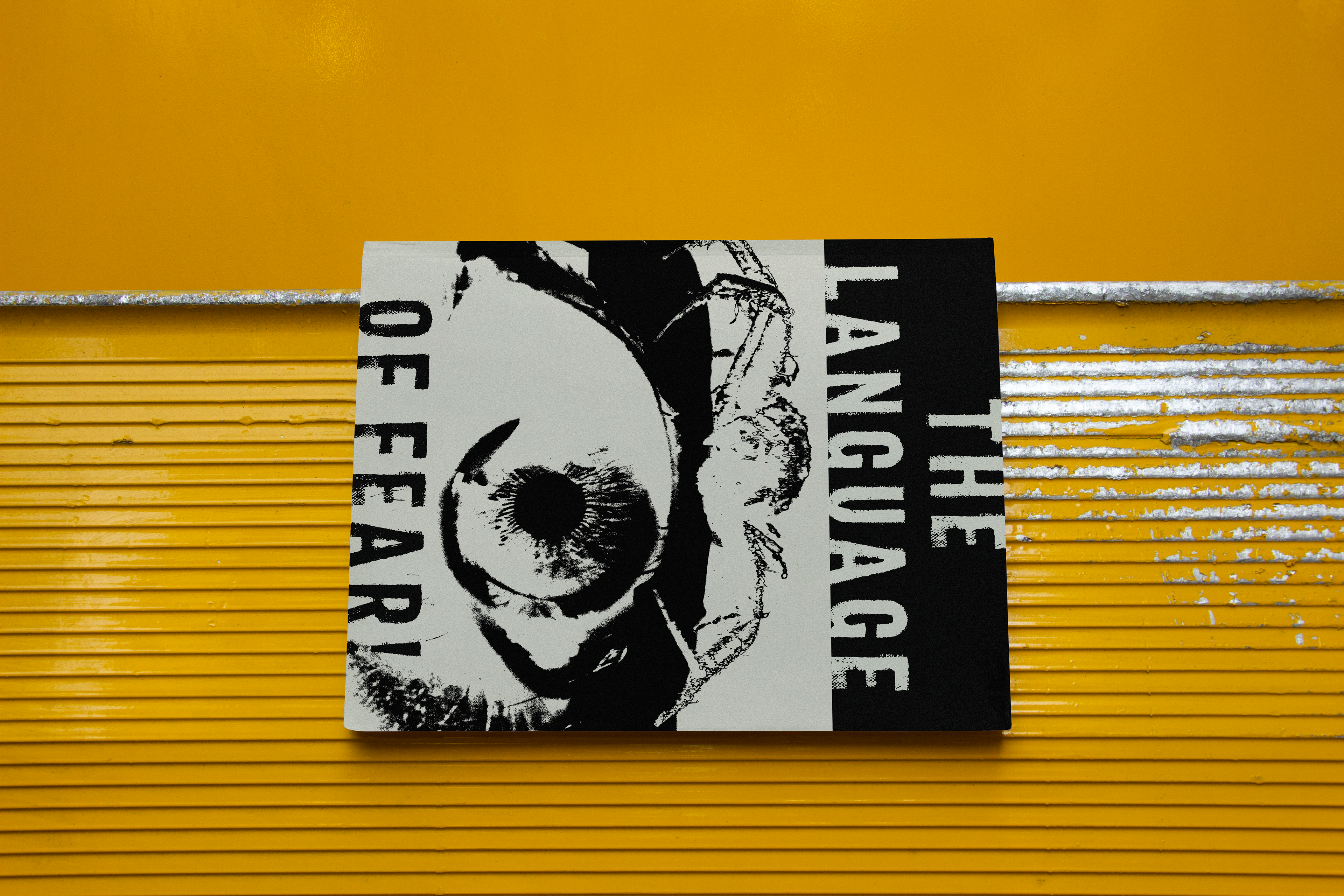
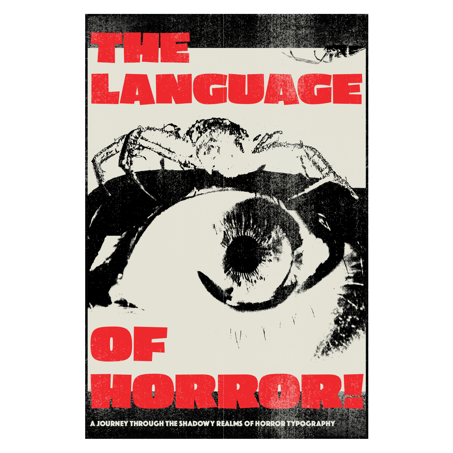
The Language of Fear is a 12-page original horror typography zine I researched, wrote, designed, and printed from 2024 through 2025.
It traces the evolution of horror design through a psychological and historical lens, with rich imagery and a limited blood-red, beige, and black palette.
Printed on recycled 100lb uncoated matte stock, the final piece is a velvety tactile experience.
I’m currently expanding the project into a full magazine series as part of a workshop led by Wieden+Kennedy Art Director, Anna Broujean.

Goals
As a designer, storyteller, and lifelong film enthusiast, I set out to answer the following questions:
1. What role does typography play in shaping emotional responses to horror?
2. Can historical typographic motifs still provoke fear in modern audiences?
3. How does the transition between oral, literary, and cinematic horror affect design as a whole?
Research
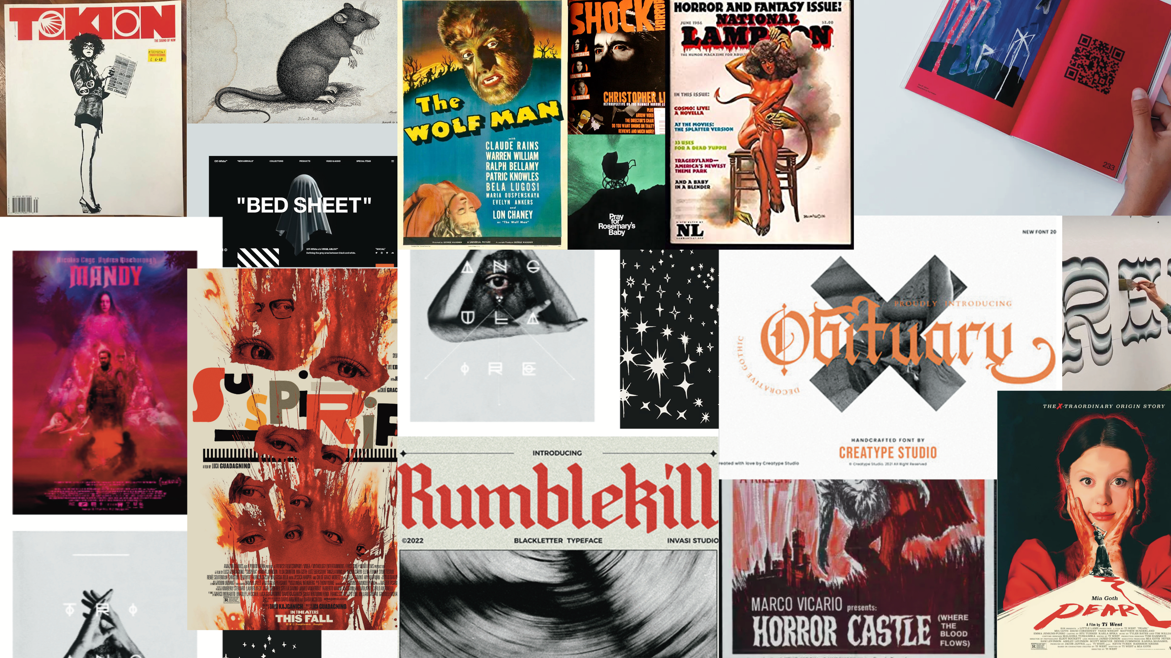
I collected visual references from horror films, posters, and typography archives.
My moodboards focused on recurring themes like decayed architecture, insects, and high-contrast type.
I reviewed articles including The Art of Terror and Subversive Horror Typography to trace how horror design has changed over time. This helped me understand how typography contributes to atmosphere and meaning in the genre.
The research shaped both the writing and visual direction of the zine.
1. Psychological Research
Explored psychological studies on how typography and color affect fear responses.
Explored psychological studies on how typography and color affect fear responses.
Key insight: Serif fonts with uneven baselines or jagged edges are more likely to trigger feelings of discomfort or tension, especially when paired with high-contrast palettes.
2. Cultural Analysis
Reviewed over 100 horror film posters and title sequences from 1920–2024 to identify typographic shifts across subgenres.
Findings: Periods of social unrest often align with grittier, fractured fonts (e.g., the 1970s slasher era), while post-2010 horror leans toward restrained minimalism as a vehicle for dread
3. Comparative Media Studies
Compared horror typography in books, films, and games to trace genre-specific type conventions and how they migrate across platforms.
Example: The clean, symmetrical elegance of Hereditary's title font heightens the realism and slowly unfolding dread (an aesthetic also seen in indie horror games)
Compared horror typography in books, films, and games to trace genre-specific type conventions and how they migrate across platforms.
Example: The clean, symmetrical elegance of Hereditary's title font heightens the realism and slowly unfolding dread (an aesthetic also seen in indie horror games)
4. Audience Testing
Showed mock horror titles in varying typefaces to 12 participants, asking which they found most unsettling and why.
Result: Participants consistently rated asymmetrical, handwritten, or decayed typefaces as more disturbing than digital or geometric ones.
Showed mock horror titles in varying typefaces to 12 participants, asking which they found most unsettling and why.
Result: Participants consistently rated asymmetrical, handwritten, or decayed typefaces as more disturbing than digital or geometric ones.
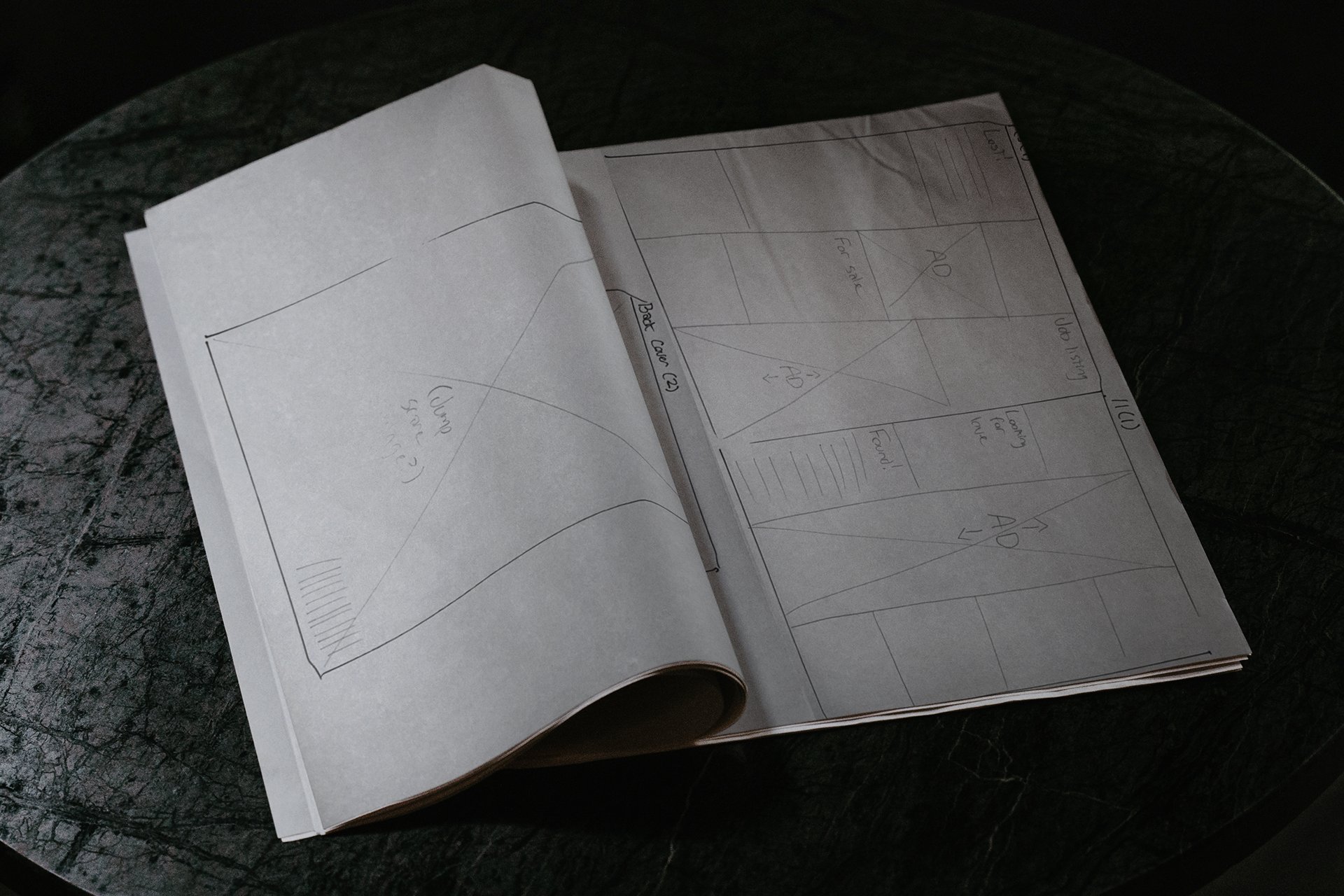
Process
I started with a series of sketches and type studies to explore how different letterforms could express fear.
From there, I wrote the content and developed a visual system around a limited palette of red, black, and beige.
I sourced and edited archival imagery, placing it alongside my writing to support the historical narrative.
Layout decisions were guided by pacing and contrast, balancing dense blocks of text with bold, quiet visuals.
Once finalized, I printed the zine on recycled uncoated paper to give it a tactile, matte finish that felt appropriate to the subject.
Final Product
The Language of Fear is a richly printed, collectible editorial zine that reimagines design history through a horror lens. It has been published in Pathos Magazine's Spring 2025 issue.
Each page acts as both narrative and visual artifact, inviting readers to question how fear is designed. It is currently being expanded into a full magazine series with guidance from How to Start a Magazine, a workshop led by Anna Broujean of Wieden+Kennedy. 💀